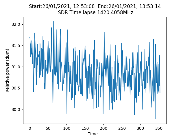
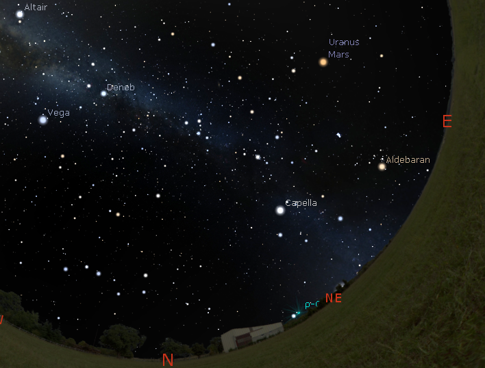
I hope to be able to ‘see’ the Hydrogen line at 1420MHz. I have a helical antenna pointing NE with an Elevation angle of about 80° and when the Milky Way comes over my location(I am using Stellarium) there should be an increase in noise, just how much I am not sure. I have written a Python app that samples the data from an RTLSDR dongle and converts it to RMS then to dBm. I do this every 10s then after say 1hour, plot a graph using pyplot.
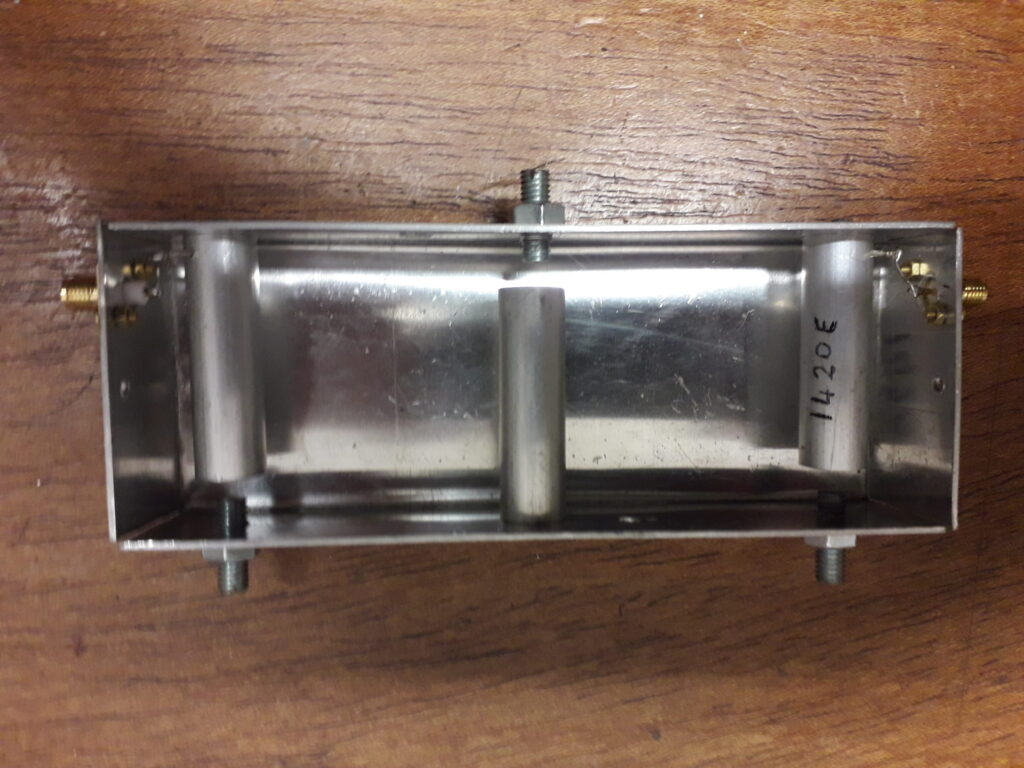
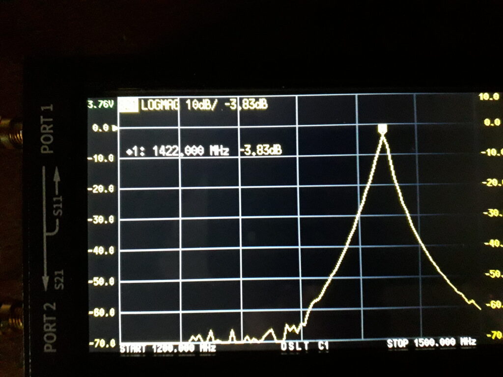
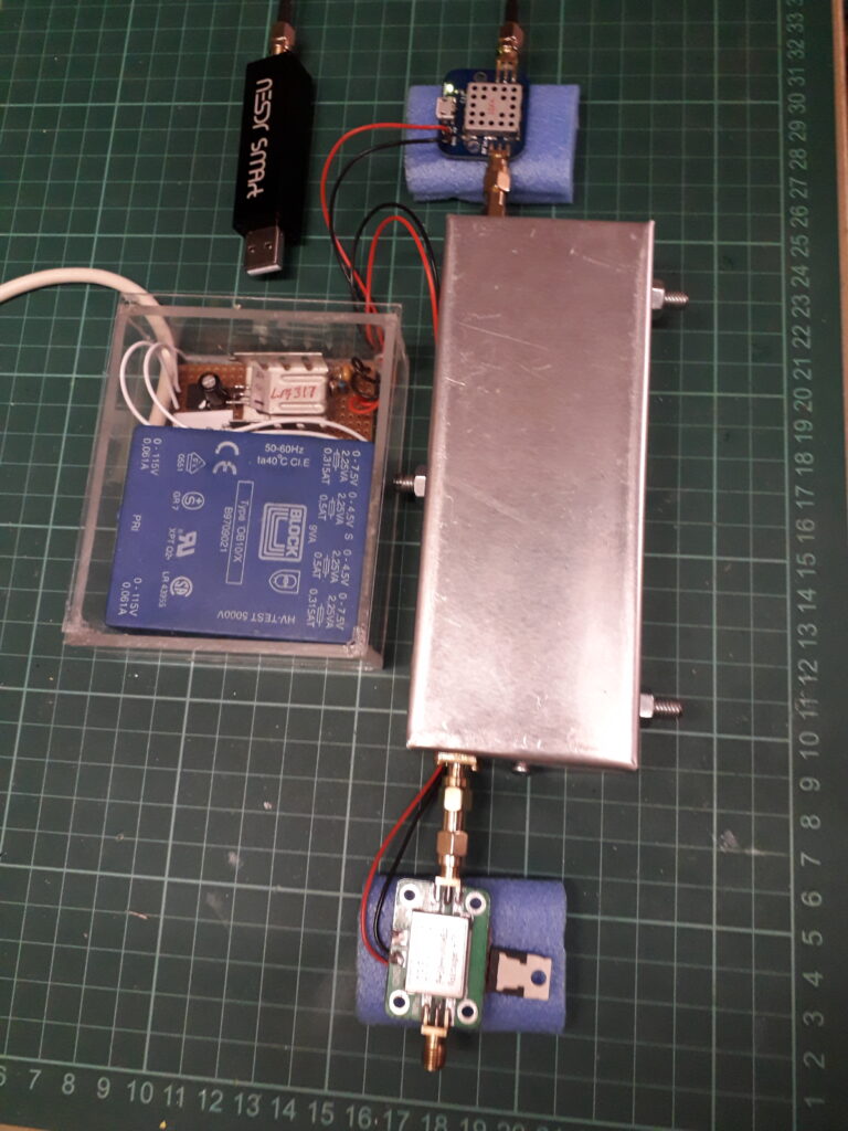
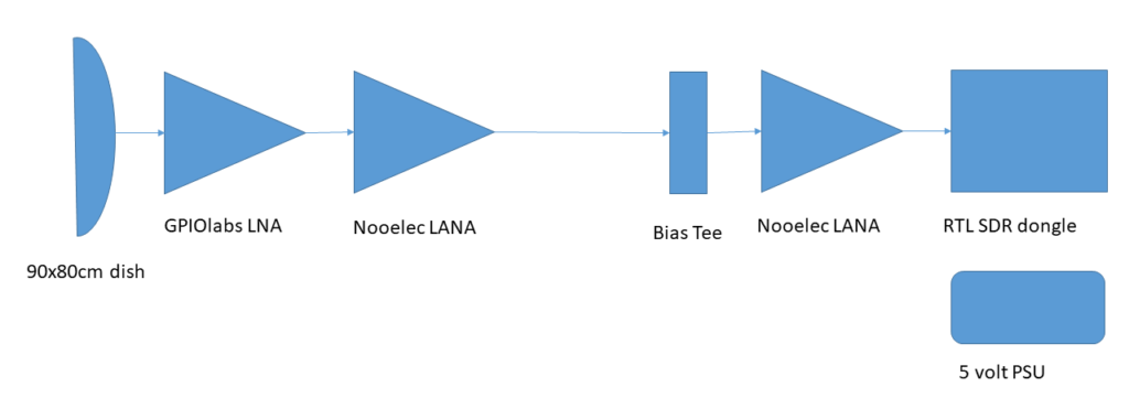
The helical antenna feeds the 1st LNA,32dB(with perferations) which includes a SAW filter which I bought from gpio Labs. This connects to the BPF which feeds the 2nd LNA (SPF5189Z, 20dB) then to the RTL dongle. The dongle is set to maximum gain so the total gain is about 100dB. I chose a linear PSU to cut down on any RF hash from a SMPSU.
The RTL dongle uses a USB link which is connected via a 35m CAT5 cable to my laptop in the house. I use a StarTech USB extender at each end which works very well, if a little pricey! I did buy a £20 unit which did not work at all even on a short length of CAT5 cable, so I think on this occasion ‘cheap and cheerful’ does not work.
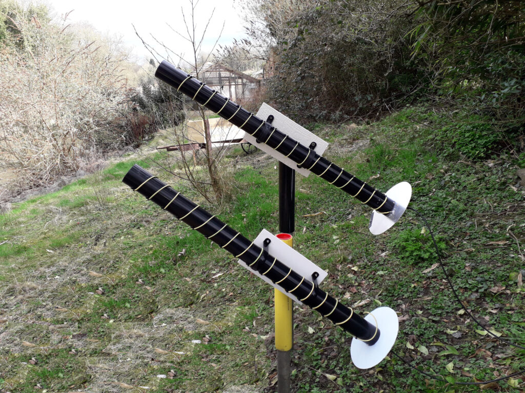
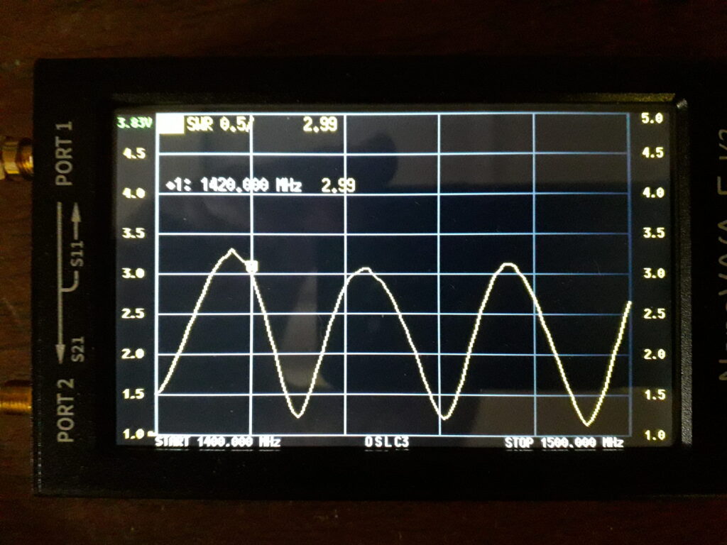
Antenna Gain (G) = 10.8+(10*log(nTurns * Space b/w coils))
This gives a calculated gain of about 30dBi, I think that might be a bit optimistic so closer to 25dBi, but this compares well with a 1m dish.
After some more researching I came across Michel Klaassen excelent site http://parac.eu/index.htm. I now understand the importance of averaging and a typical number would be between 50k to 100k. From what I can see he is ploting the doppler frequency shift of the Milky way as it passes ‘over head’
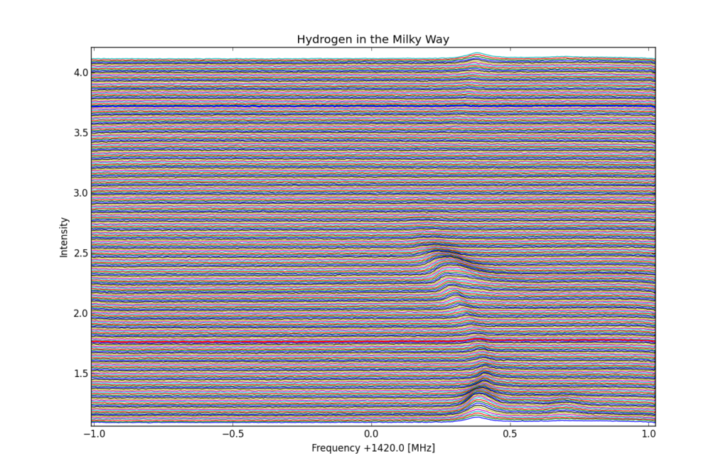
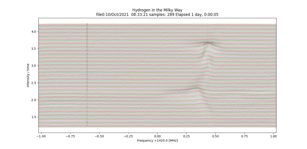
Each line represents a 5 minute 2MHz scan using the RTLSDR dongle, 288 lines make up the whole picture which takes 24 hours to complete.
From the plot it looks like about a -260kHz red shift from 1420.4 so using the formula v=df * c/f that gives 260,000 * 3*10^8/1420.40^6 = 55km/s
I now have 2 working LNAs, Nooelec and GPIOlabs. After some discussion I decided to shelve the helical antennas and try a dish with a coffee can feed horn. I think there were 2 (or more) things wrong:
I was feeding the 2 LNAs from the antenna, with 2m of coax, I now have the GPIOlabs LNA connected to the feed horn via a bias tee. Originally I bought it without the tee but noticed there was a surface mount pad connected to the output. After discussing it with GPIOLabs I added a 6uH inductor and that worked fine.
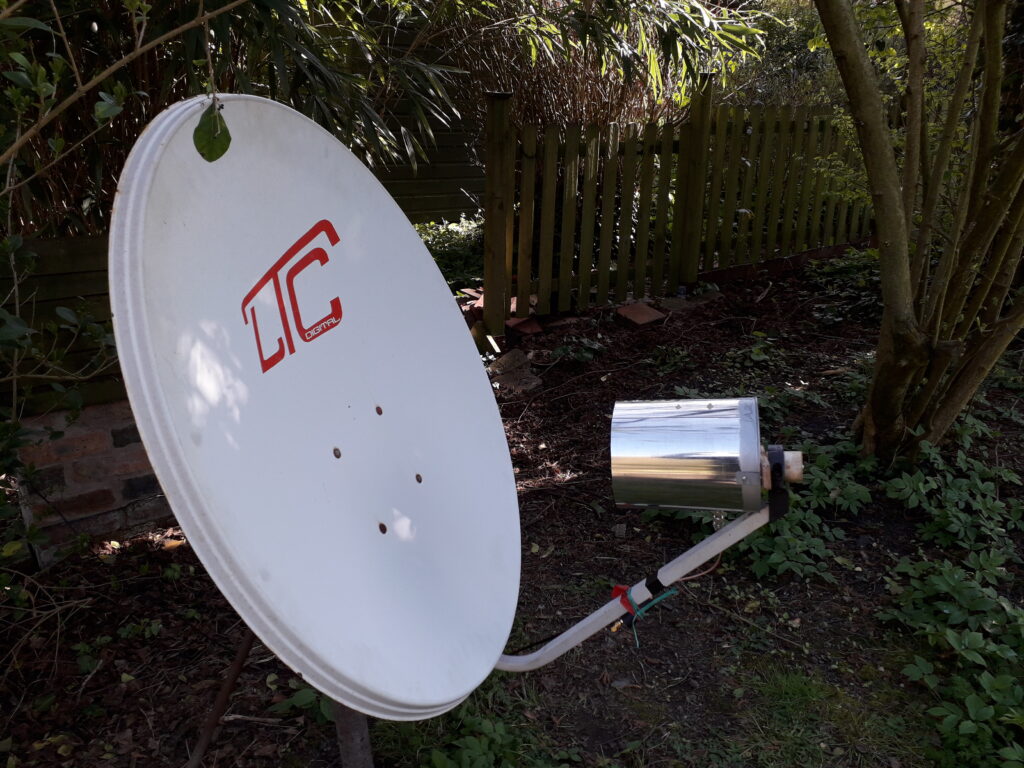
The feed horn is made from a 200mm * Ø 150mm coffee can with a ¼ wave probe that is ¼ wave from the base. It is connected to an SMA connector which connects to the coax cable. For the probe I used a narrow brass tube and inserted a piece of thick copper wire that I could slide in and out, trombone like, so as to tune it using my VNA-F V2.
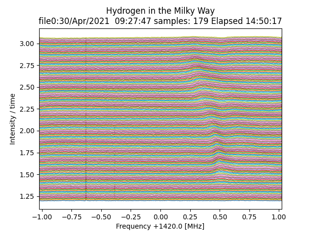
This image was created with the dish pointing NW at an elevation of about 55 degrees. It correlates well with Stelarium as the arm went passed, also although I am not sure if it is relevant, the constalation of Cassiopeia was in view.
I have added another LNA, the GPIOlabs LNA and the Nooelec LANA next to the RTL, are connected directly to the 5 volt PSU; the second Noolelec is powered via a BiasTee module. (nb I am now not using the BiasTee on the GPIOlabs LNA)
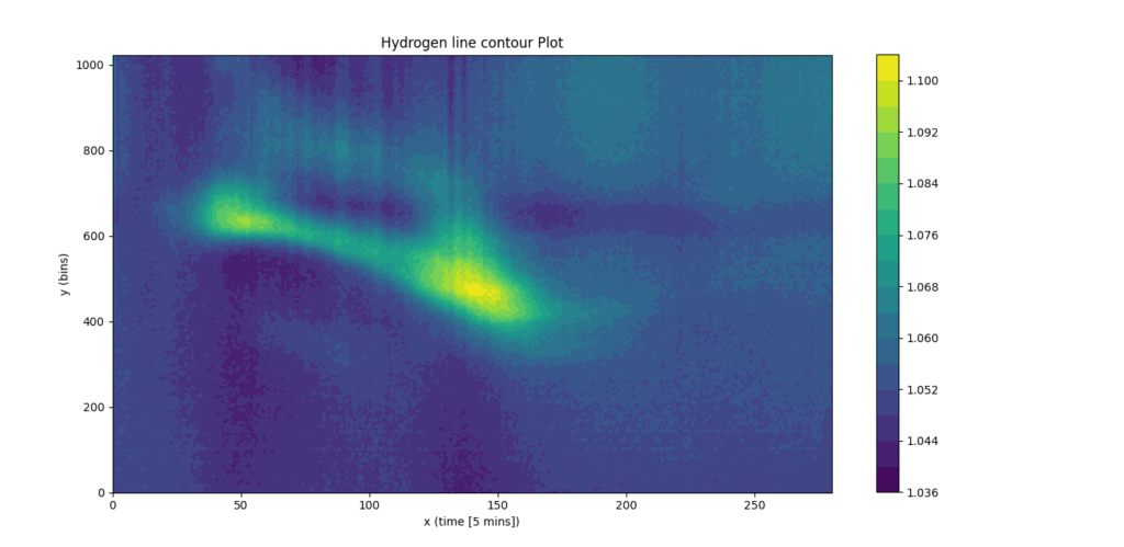
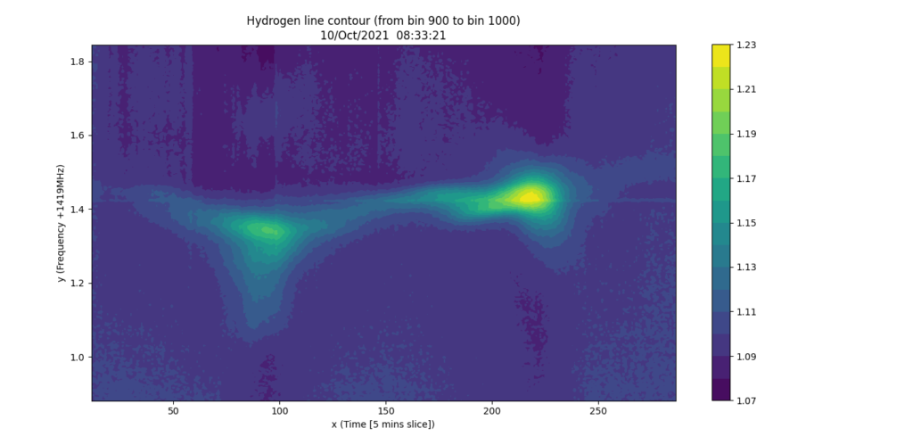
The image above was created from the same data that produced the ‘wiggly line’ image but shows more detail. Also I am only displaying 1024 bins, y axis, so as to focus on the part of interest. I have swopped the axes so x now shows time in 5 minute intervals, so again this has taken 24hrs to produce. The time difference between the 2 blobs is about 8hrs.
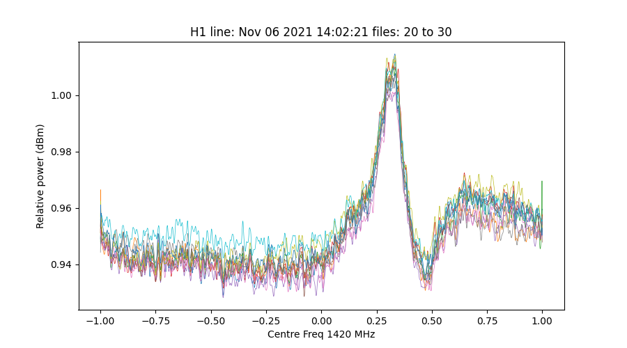
I have now witten my own Python data creation program, it works in the same way as Michel Klaassen’s software but can be run without the use of SDR# and that allows me to create data automatically at any time. The 2048*128 sample from the SDR dongle is passed through matplotlib ‘power spectral density’ funtion 350 times, averaged by column, ‘convolved’ across the 2048 bins and written to file. Each file takes about 90 seconds to create.
